
There’s a twin-tailed siren on your coffee cup, and she’s been doing her job for over fifty years.
Most people glance at the Starbucks logo and see a mermaid-looking figure in green. What they’re actually looking at is one of the most effective pieces of brand psychology on the planet.
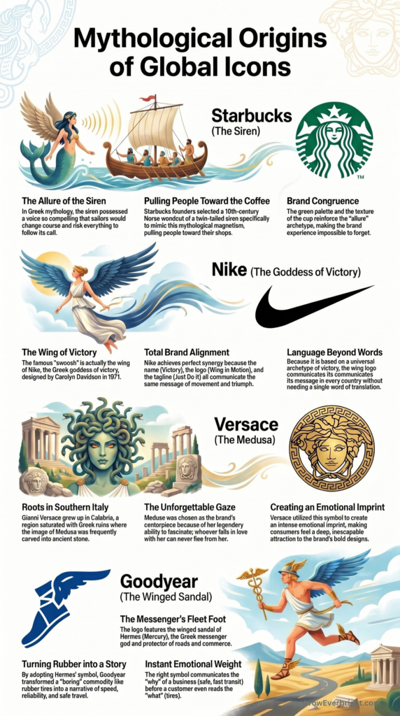
The founders of Starbucks discovered that image in a sixteenth-century Norse woodcut while flipping through old seafaring books, and they chose her for a very specific reason: sirens pull people toward them. In Greek mythology, the siren’s voice was so compelling that sailors changed course to follow it. Starbucks wanted its coffee to do the same thing.
Here’s why that matters if you run a roofing company, a restoration business, a locksmith service, or a law practice: the siren works because she taps into something that existed in the human mind long before Starbucks printed its first cup. And every brand, including yours, is already using this same symbolism in marketing. The only question is whether you’re speaking it on purpose.
Your Brain Came Pre-Loaded with a Symbol Library
Every culture on earth, independently and without contact, invented the same characters. The hero who overcomes impossible odds. The guardian who protects the vulnerable. These figures show up in ancient Greece, feudal Japan, and pre-colonial West Africa as if every civilization drew from the same deep well.
Carl Jung spent decades trying to understand why. His answer was the collective unconscious: a shared reservoir of inherited symbols, patterns, and instincts that every human being carries from birth. Jung called these patterns archetypes, and they function like pre-installed psychological software. Before your customer ever sees your logo, reads your website, or hears your company name, their brain is already running this software, already primed to recognize certain symbolic cues and assign them meaning.
That’s why Nike’s swoosh communicates victory in every country on earth without a single word of translation. The wing of a goddess speaks a language older than any alphabet. And that same symbolism in marketing is available to every business willing to learn it.
How the Biggest Brands on Earth Figured This Out
The most recognizable companies in the world built their identities on mythological symbolism. Each one illustrates a different strategic principle, and each principle applies directly to businesses of any size.
Nike: Total Alignment
The swoosh represents the wing of Nike, the Greek goddess of victory. Carolyn Davidson designed it in 1971 for thirty-five dollars. And here’s why it became one of the most powerful symbols on the planet: everything in that brand says the same thing. The name means victory. The logo is a wing in motion. The tagline tells you to move. There’s zero contradiction anywhere in the system, and that’s the whole game.
Your brand is a system too. Most business owners built theirs one random decision at a time, and the customer’s brain is trying to read all of it as a single coherent message. When the pieces align, trust happens fast. When they pull in different directions, people feel friction and move on.
Your prospect will never say, ‘Your brand symbols are misaligned.’ They’ll say ‘something felt off’ and call someone else.
Versace: The Unforgettable Over the Safe
Gianni Versace grew up in Calabria, a region of southern Italy saturated with Greek ruins and mythology. As a child, he played on floors where the image of Medusa was carved into ancient stone. When he launched his fashion house, he put Medusa at the center. His sister Donatella later explained his reasoning: whoever falls in love with Medusa can never flee from her. Versace wanted people to feel the same way about his designs.
Versace understood that the most memorable symbols carry intensity. Dozens of companies in your service area offer similar work at similar prices, and the brand that creates the strongest emotional imprint wins the call. Timid branding rarely creates imprints. A bold, deliberate identity that makes someone feel something will outperform a safe, forgettable one every time.
Goodyear: Turning a Commodity Into a Story
Goodyear sells tires. Rubber. One of the most boring product categories on earth. And they made it mean something by putting the winged sandal of Hermes on every single one. Hermes was the Greek messenger god and protector of roads and commerce. Speed, reliability, and safe travel are encoded into a single image. The winged sandal turned rubber into a story.
That’s the move most businesses miss. You already do meaningful work. Your customers’ lives genuinely change because of what you offer. But your brand probably describes what you do instead of why it matters. The right symbol closes that gap instantly. It communicates the emotional weight of your work before someone reads a word of copy or clicks through to your website.
Your Brand Is Already Speaking in Symbols
The Starbucks siren and the Nike swoosh are dramatic examples. But you’ve been sending symbolic signals since the day you launched your business. Your colors, fonts, logo shape, the imagery on your website, even your business name: your customers’ brains process all of it in milliseconds.
The question is whether those signals are telling the story you want told.
Color: The Loudest Signal You Probably Chose by Accident
Research shows that color accounts for up to 90% of a first impression. Consistent use of a signature palette can increase brand recognition by up to 80% and influence 62% to 90% of purchasing decisions. Let those numbers sink in for a second, especially if you picked your brand colors years ago without giving them much thought.
Color speaks to the oldest parts of the human brain.
- Blue triggers a sense of safety and competence, likely because our earliest ancestors associated it with clear skies and clean water. Financial institutions, healthcare companies, and tech firms lean heavily on blue for this reason.
- Green signals vitality and renewal because a green landscape is a thriving landscape.
- Earthy tones like ochre and deep brown signal permanence and craftsmanship, the visual language of materials that endure.
Here’s where it gets strategic. Your colors need to match your brand’s core promise. If your business runs on urgency and responsiveness, a palette of soft pastels quietly undermines that message. The customer may never consciously spot the disconnect, but their gut will.
Fonts, Shapes, and the Signals Hiding in Plain Sight
Typography has personality, and customers read that personality before they read a single word. A strong serif font, the kind with fine lines extending from each letter, signals tradition and established authority. A clean sans-serif signals clarity and modernity. The shape of the letters themselves carries a message, and that message shapes how people receive everything that follows.
Logo shapes work the same way. A circle evokes community, wholeness, and continuity. A rectangle signals structure and stability. An angular form communicates precision and forward movement. These are small choices that do heavy psychological lifting.
Your Name and Your Imagery Are Already Doing Symbolic Work
Nature imagery is the oldest symbolic vocabulary humans have, and the most universally understood.
- An oak communicates strength and deep-rooted wisdom.
- A river communicates adaptability.
- A mountain communicates endurance and the pursuit of something higher.
These images carry thousands of years of emotional resonance, and any business can claim them.
Your company name works the same way.
- Amazon named itself after the warrior women of Greek mythology, and the brand carries that energy of scale and boldness.
- A coaching practice called “Trailhead” encapsulates new beginnings and guided exploration in a single word.
- A design studio called “Cornerstone” signals foundational importance every time someone says the name aloud.
Whether you chose your name with deep intention or grabbed it in a rush, your customers assign it symbolic meaning the moment they encounter it.
Imagine you’re comparing two businesses that do identical work at identical quality. One has a brand where the colors, the imagery, the name, and the typography all evoke the same feeling, something coherent and intentional that mirrors the care behind the work. The other looks like it was assembled from a grab bag of templates and stock photos over the last decade. Both businesses might deliver equally, but which feels more reliable?
How to Audit Your Brand’s Symbolic Language
Starbucks, Nike, and Versace achieved their impact by aligning all their symbols in the same direction. You can do the same thing at any scale, and it starts with one question:
What do I want my customer to feel about my company in the first three seconds?
Write down three words. Maybe yours are confident, inspired, and understood. Maybe they’re safe, respected, and energized. These feeling-words become your symbolic compass; every decision flows from them.
Now hold that compass up to your brand:
- Do your colors evoke the emotional territory those words describe?
- Does the personality of your typography match the personality of your business?
- When someone lands on your website or scrolls your social feed, do the images communicate the energy of your work?
Your company name deserves the same scrutiny. Some names carry immediate emotional resonance. Others are purely descriptive, and if yours falls in that camp, your visual symbols carry even more weight because the name alone leaves a gap the rest of the brand has to fill.
You don’t have to do this all at once. Every time you update any piece of your brand, run it through your three words first. And if your name already carries recognition in your market, that recognition is an asset. Build the rest of your symbols around it.
Why This Work Compounds Over Time
Every time a customer encounters your brand and feels the same thing, that feeling gets stronger. Consistency compounds. Six months of aligned symbols create recognition. A few years of it creates something your competitors can’t buy or copy.
Starbucks built a global empire around a mythological figure most people can barely name. That’s the point. The siren works because she taps into something already embedded in the human psyche, an archetype of allure and magnetism that’s been pulling people in for thousands of years. And Starbucks reinforces that pull through every single brand element. The green palette. The warm lighting. The texture of the cup in your hand. All of it saying the same thing. The archetype creates the feeling, and the brand congruence makes it impossible to forget.
You have that same opportunity. The symbols are already out there, speaking on your behalf every day. The only question is whether they’re telling the story you want to tell.
If you’re looking at your brand right now and realizing the symbols are telling six different stories, let’s fix that. Book a call, and we’ll find the thread that ties it all together.